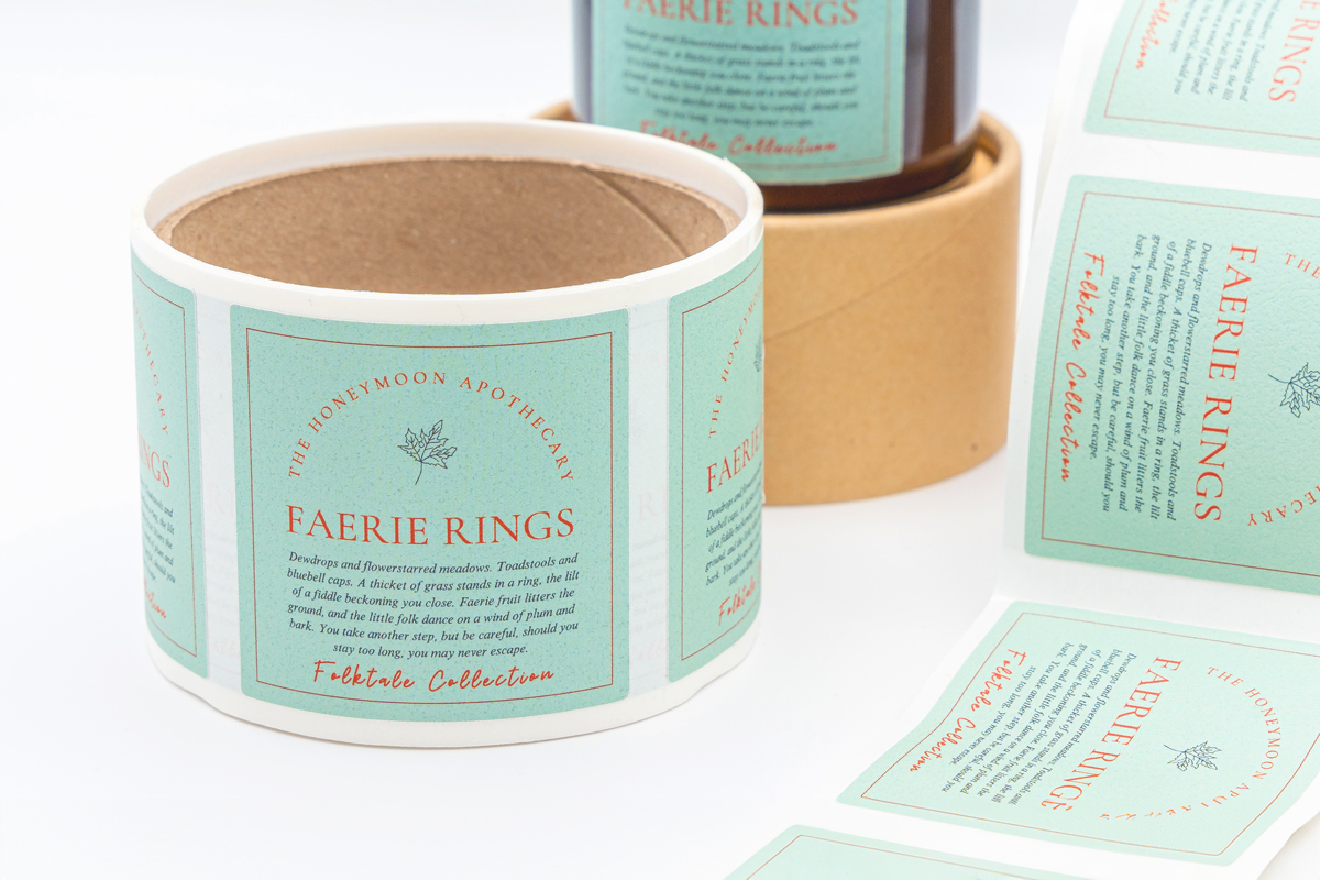
Don’t underestimate the impact a professional, well-designed sticker or label can have on how customers perceive your brand. It doesn’t just provide information and name a product, it grabs attention, communicates quality and premiumises your entire business. Things like bleed, safe areas, and font choice make a big difference between a sticker that looks homemade, and a label that’s ready to hit the shelves.
Key Design Considerations for Stickers and Labels
Before diving into colours, logos and fancy fonts, you need to take a moment to understand the ins and outs of label and sticker design. Though small, these details are important, and yet they’re often overlooked. They can make or break the final design, especially when it comes to printing. By familiarising yourself with the key design considerations for stickers and labels, you can save yourself time, frustration and costly reprints.
Bleed and Safe Area
This is a safety net for your sticker or label design. Whether you’re
designing artwork for a custom shape or a more standard size, don’t underestimate the importance of having a bleed and safe area.
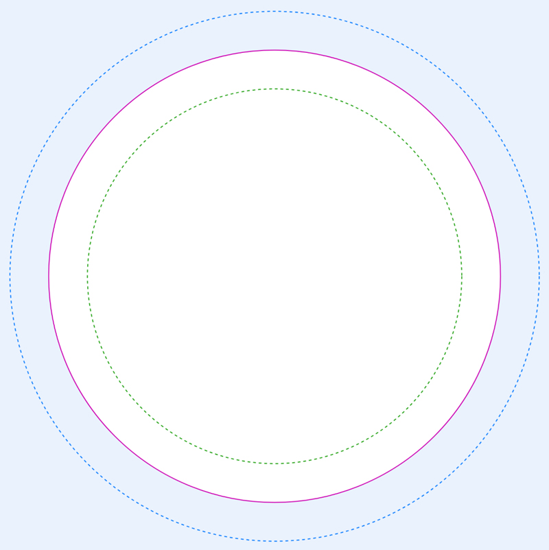
Bleed - The bleed is a 3mm border that extends beyond the finished trim edge of your label or sticker. When labels are cut from a printed sheet, the trimming process isn’t always completely accurate. There’s a margin for error, even if you’re using the most precise cutting machines. Without a bleed, you risk ending up with thin white edges where the paper shows through. Bleed ensures that your background colours or patterns go right to the edge, even if the cut is ever so slightly off.
Safe Area - The safe area is a 3mm margin inside the trim edge. This is where all the critical content - including logos, text, ingredient lists and QR codes - should go. If your design moves slightly during printing, anything too close to the edge risks being chopped off. But, a safe area prevents this. Even a small shift can ruin the entire label, but the safe area ensures no important information is missed.
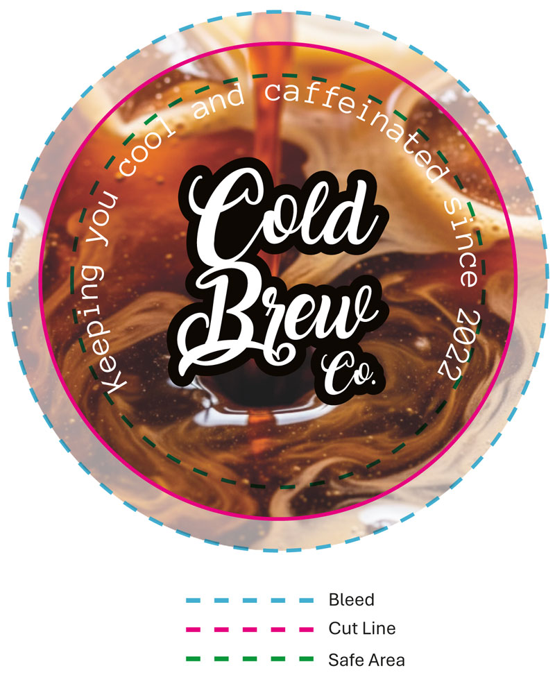
If you want to guarantee that your logo and text aren’t accidentally cut off during printing,
make sure your design factors in a bleed and safe area. It’s a simple way to ensure a professional finish every time.
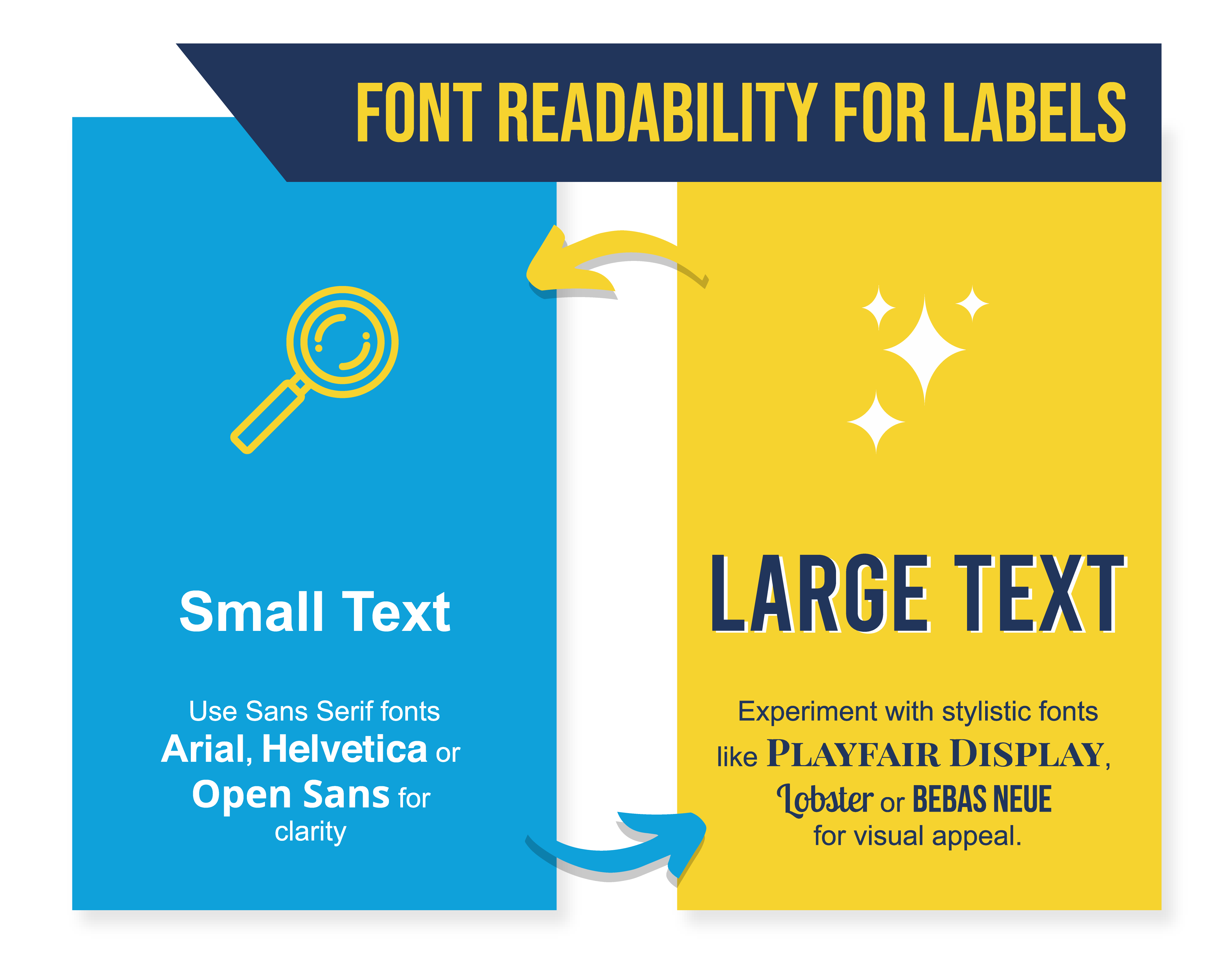
Font Readability
Your font doesn’t just deliver your message, it is part of your label or sticker design. The right font reinforces your brand’s personality, and sets the vibe for your product. But, it’s not all about style, and legibility is a lot more important. If you choose the wrong font, people will be left trying to work out what exactly the label says, potentially missing important information. Though a font might look great on a large computer screen, it can quickly become unreadable once it’s printed at a smaller label.
For Small Text (Below 10pt)
Small font is ideal for essential information, such as ingredients, instructions, contact information and legal disclaimers. If your customer can’t read this, it’s not just a design flaw, it could be a liability and safety hazard.
- Stick to Sans-Serif Fonts - Clean, modern fonts like Helvetica, Arial or Open Sans are ideal for small text. These fonts don’t have the tiny decorative strokes that could blur together when printed. They also boast taller lowercase letters and generous spacing, which improves legibility.
- Minimum Size Matters - Technically, vector text can print as small as 3pt. But, that’s extremely hard to read. It’s best to choose a minimum font size of 6pt for any text you want your customers to actually read, going as large as 7pt or 8pt if you have enough space.
It’s a good idea to print a test label at actual size before sending it to the printer, this will enable you to check that your chosen font is readable in real life.
For Large Text (Above 10pt)
Large text is used for product names, brand names, taglines or headlines, and it’s your opportunity to make an impression.
- Add Style and Flair - When you’re working with larger sizes, you can branch out into more expressive fonts. Serif fonts like Playfair Display add a sense of tradition and elegance, whereas display fonts like Bebas Neue or Montserrat ExtraBold can give your brand a bold, modern edge.
- Be Careful When Using Script Fonts - Handwritten or calligraphy-style fonts can be a stunning addition to a label or sticker, especially for brand names or accents. But, they’re not always best for conveying vital information. They’re often too hard to read at smaller sizes or from a distance, and you don’t want to risk people not being able to read allergens, ingredients and safety warnings.
Colours for Print
Your design might look vibrant and flawless on your screen, but that doesn’t mean it’ll look the same once it’s printed on a label or sticker. One of the most common design pitfalls is not understanding how colour behaves in print, and it doesn’t always align with what you see digitally. To avoid surprises - and to make sure you don’t end up having to pay for expensive reprints - you need to design with print colour in mind.
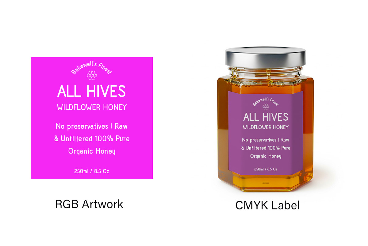
Design in CMYK, Not RGB
Most screens use the RGB colour model - red, green and blue - which blends light to create colour. This is perfect for digital displays, but it doesn’t translate to ink. This is because printers use CMYK - cyan, magenta, yellow and black - which is a pigment-based approach to colour.
Colours given in RGB can appear more vibrant than what’s possible in print, especially neon tones or vivid blues and greens. If you design in RGB and then convert to CMYK later, you may end up with unexpected dullness or changes in colour. To avoid this, set your design file to CMYK from the moment you start designing. By doing so, you’re working with colours that are closer to what will actually be printed.
Contrast is Key in Sticker and Label Design
A beautiful sticker design is pointless if no one can read what it says, which is why a strong contrast between the text and background is essential for legibility. Dark text on a light background - for example, black on white or navy on pale yellow - work well, as does light text on a dark background, such as white on dark green. Try to avoid low contrast colour combos, like light grey on white, or red on dark orange. They might look good to start with, but they're often unreadable, especially on smaller labels or from a distance.
Material Affects Colour
Your design will be placed on a physical surface, and the material of the surface can dramatically affect how colours appear. For example, glossy white paper reflects more light, which makes colours appear bolder and more vibrant. Matte finishes tend to soften colours, often muting brightness and contrast. Kraft or recycled paper adds an earthy tone, so colours look warmer, more muted and less saturated.
If you're printing on a non-white or textured material, do a test print first to see how your chosen colours come out. Though they may look bright and bold on a white background, they could look completely different on anything else.
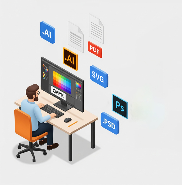
Choosing the Right Design Software for Your Stickers
To create a high quality sticker or label design, you’ll need to use the right design software. There are a range of options available that work well with printer specifications, with both paid for and free software available.
Adobe Illustrator
Adobe Illustrator is one of the most popular softwares for label and sticker design, and it’s one that a lot of printers recommend. It’s a vector-based program, meaning it uses numbers and equations to create graphics. This allows your design to be scaled to any size - regardless of whether you’re designing a tiny product label or giant window decal - without any of the design quality being lost.
Adobe Photoshop
Adobe Photoshop is slightly different as it’s a raster-based program, largely designed for editing photos and creating pixel-based artwork. If your sticker design is based on a photograph or features complex or rich textures, Photoshop is likely to be one of the better tools to use, as long as you work with a very high resolution from the start of your design process.
Canva
Canva is a free-to-use and user-friendly alternative to Adobe Illustrator and Adobe Photoshop; it provides a simple, quick approach to sticker and label design. With thousands of templates and an intuitive drag-and-drop interface, it’s been built with design newbies in mind. Though it doesn’t boast as many features as Illustrator and Photoshop, it has everything you should need for a simple sticker or label design. When using Canva, select the "PDF Print" option, as this will convert your design to the required CMYK format for printing.
Creating the Perfect Print-Ready Output File for Stickers and Labels
When it comes to creating a professional sticker or label, the way in which you save your file is one of the most important things to consider. Sending the wrong output file format to be printed can lead to blurry images, incorrect colours and costly reprints.
Always Use CMYK
Your computer screen displays colours in RGB - red, green and blue - but professional printers use CMYK, which is made up of cyan, magenta, yellow and key, meaning black. If you design in RGB and convert the file later, you’ll probably notice a change in your chosen colours. To avoid this, set your colour mode to CMYK from the very beginning, before you even start designing. This will ensure that the colours you see on your screen are as close as possible to the final printed sticker or label.
File Format and Resolution
It’s best to use vector images when you’re designing labels and stickers, as this guarantees sharp, clean lines at any size. This means using .AI, .EPS, .SVG, or a high quality .PDF file with editable vector data preserved.
If your design is raster-based - for example, if you’ve designed your sticker or label in Photoshop or Canva - it must have a high resolution. The industry standard minimum is 300 DPI and for intricate designs with fine details, 600 DPI is even better. These should be saved as .PSD, .TIFF or a maximum quality .JPEG file.
Avoid These Common Sticker and Label Design Mistakes
Even the most creative label designs can fall flat due to a few technical mistakes. Luckily, these sticker and label design mistakes are easy to avoid, once you know what to watch out for.
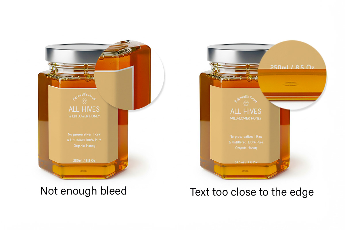
Forgetting to Add Bleed
If you’ve placed your background colour or image right up to the edge of the label, you’ve made a mistake. Though it looks great on a screen, that won’t be the case if the labels are trimmed, as even the slightest shift can leave thin, white borders around the edge. Avoid this by extending your background - or any edge-to-edge design elements - 3mm beyond the trim line. This bleed ensures that even with slight cutting variations, your design still reaches all the way to the edge.
Text on the Edge
You’ve perfectly centred your website, phone number and slogan, but then it’s chopped off in the trimming process. Cutting machines can shift by smaller-than-a-millimetre amounts, and anything too close to the edge is at risk of being missed. This is why it’s important to keep all important content within the 3mm safe area. This invisible boundary acts as a safety buffer, ensuring your text stays intact and your design looks polished.
Designing in RGB
If you design in RGB, you’ll notice that everything looks bold and bright on screen. But, when printed, those colours can look muted, different to what you envisioned. This is why it’s important to start your project in CMYK colour mode, the format printers actually use. This ensures that you're working with colours that translate accurately from screen to print, helping you avoid surprises when your labels are printed.
Using “Rich Black” for Small Text
If you’re using “rich black” for small text, you’re going to run into problems. It’s a type of black that’s made up of multiple ink colours - often a mix of cyan, magenta, yellow and black - and though it can look great in large solid areas, it often comes out looking fuzzy, with misaligned characters due to ink registration issues when it’s used for labels. For crisp, sharp black text, use 100% K ink, with 0% cyan, magenta and yellow.
Define Your Target Audience for Maximum Impact
It’s important that your sticker or label design connects with your target audience. After all, they're the people you’ve designed it for. Before you finalise your colours, fonts and commit to printing, find the time to ensure it’s appealing to the audience you’re trying to engage.
- Think about who the design is for, as a sticker for a corporate event requires a very different style than one for a local music festival. Consider the age, style and interests of your ideal consumer, and identify what kind of designs they’re most drawn to.
- Context is an important part of the design process, so think about where your sticker or label will be seen. A label on a luxury skincare bottle should convey elegance and calm, whereas a sticker on a kids’ toy should be fun and energetic.
Conduct Market Research
If you can, conduct some market research before finalising your design. Look at competitor brands in your niche and compare your design to what they’re doing. The colours, fonts and visuals they're using will give you insight into the visual expectations of your audience. You can then make sure your design meets those expectations, or it stands out in a way that disrupts the industry.
By understanding your target audience, you can create a design that not only looks, good but also communicates the right message and drives results
Sticker and Label Design Tips and Best Practices
Once you've mastered the basics of creating a sticker or label design, you can take things to the next level with a few tips and tricks, which transforms a standard design into a professional creation.
Consider Using a Printer Template
Every label printer has different specifications, and guessing them could send you down the wrong path. It can be helpful to use a properly sized template including built-in guidelines for the trim line, bleed and safe area, which can make the design process smoother. If you can, request a template from your printer before you start designing, and use it as a reference to help your layout align with relevant specifications.
Zoom in 100%
Viewing your design at 100% zoom gives you the most realistic ideal of how your label will print.If you view it at actual size, you might not pick up on any blurred or hard-to-read sections. Zoom in to 100% and check the text is legible, the lines are crisp and nothing feels crowded. If it’s hard to read or looks blurry on screen, it will look worse in print.
Only Use Two Fonts
You might be tempted to use a wide range of impressive fonts, but keeping your selection minimal - ideally to two or three, if possible - tends to create a cleaner, more professional design. Using too many fonts can make your design feel chaotic, and customers tend to respond better to clean typography. A good approach is to use one font for headlines and another complementary one for the body of text. Look for enough contrast that there’s a font hierarchy, whilst ensuring the fonts still work well together.
Print a Test Sticker or Label
You’d be surprised how often spelling errors, awkward spacing or misaligned elements slip past even the most careful designer. If an error shows up after you’ve paid for and printed hundreds of labels, you’re going to be out of pocket. Not only will you have the stress of reorganising the design, but you’ll also need to pay for another batch.
Before sending your file to the printer, do a quick test run. Check the logo is sharp and properly placed, that all the text can be read, and key elements are inside the safe area. Double-check sizing, placement and spelling.